gis
For Task 2, you’ve been asked to further illustrate the comparison between the raster DEMs and speculate about the relative advantages and disadvantages of each for use in the watershed stewardship analysis. Pulling comparative elevations from the same location on each raster will give you a tool to compare and discuss one facet of raster differences.
I would suggest focusing your analysis in an area where all four datasets overlap within the watershed (e.g. Solitude Ski Resort). There are some minimal hints and instructions below; you are left largely to your own creativity and judgment as to how exactly you should make this comparison using the contours. See the What to Submit section for minimum requirements and some guidelines.
Suggested Area to Focus Your Comparison
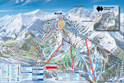
Go to Solitude Ski Resort:
One project the Cottonwood Canyon foundation would like to develop in the coming months is to post signs at the different peaks around the rim of the watershed. These interpretive style signs would offer different historical stories about the canyon and give the local elevation.
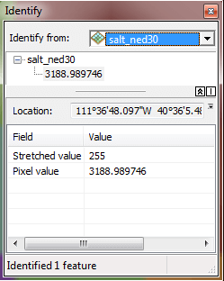
Use the coordinates 448052 m easting 4494710 m northing to locate a specific point near a Solitude Mountain peak (see Lab 5 for a refresher on adding points from coordinates). This point marks the cell containing the highest value or the local peak location on the 2m lidar DEM. This point will not mark the actual location of the highest point on the 5 m, 10 m, and 30 m DEMs. You will have to locate the highest cell value (in proximity to this point) on each of the DEMs. Using the Identify tool  note the elevation values of the cell you think contains this local peak from each of the 4 datasets you are working with. To make a valid comparison, you must be careful to compare cell values at the same (highest) location/cell. Are the values the same? Why or why not? What do you know about the raster data sets you are working with that might explain the variation you see in the elevations? What do you know about raster datasets that might explain the “movement” of this peak location?
Here are a couple of hints that might make this comparison easier. First, stack your DEMs in the table of contents so that they are drawing from highest resolution on top to lowest resolution on the bottom. Give each DEM an extreme color ramp (properties > symbology) in order to exaggerate the elevation. In the statistics section of the symbology window, note that you can set the color ramp to display on the range of values in the current display extent. This exaggerates the stretch of the color ramp even more.
note the elevation values of the cell you think contains this local peak from each of the 4 datasets you are working with. To make a valid comparison, you must be careful to compare cell values at the same (highest) location/cell. Are the values the same? Why or why not? What do you know about the raster data sets you are working with that might explain the variation you see in the elevations? What do you know about raster datasets that might explain the “movement” of this peak location?
Here are a couple of hints that might make this comparison easier. First, stack your DEMs in the table of contents so that they are drawing from highest resolution on top to lowest resolution on the bottom. Give each DEM an extreme color ramp (properties > symbology) in order to exaggerate the elevation. In the statistics section of the symbology window, note that you can set the color ramp to display on the range of values in the current display extent. This exaggerates the stretch of the color ramp even more.
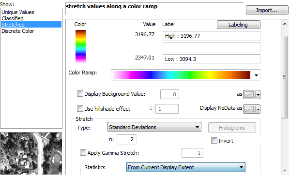
Set up the symbology for all 4 data sets this way.
You will want to zoom to an extent that allows you to see the peak and to be sure you are pulling elevation info from the correct cell. (You may need to zoom in and out and pan around to do this.)
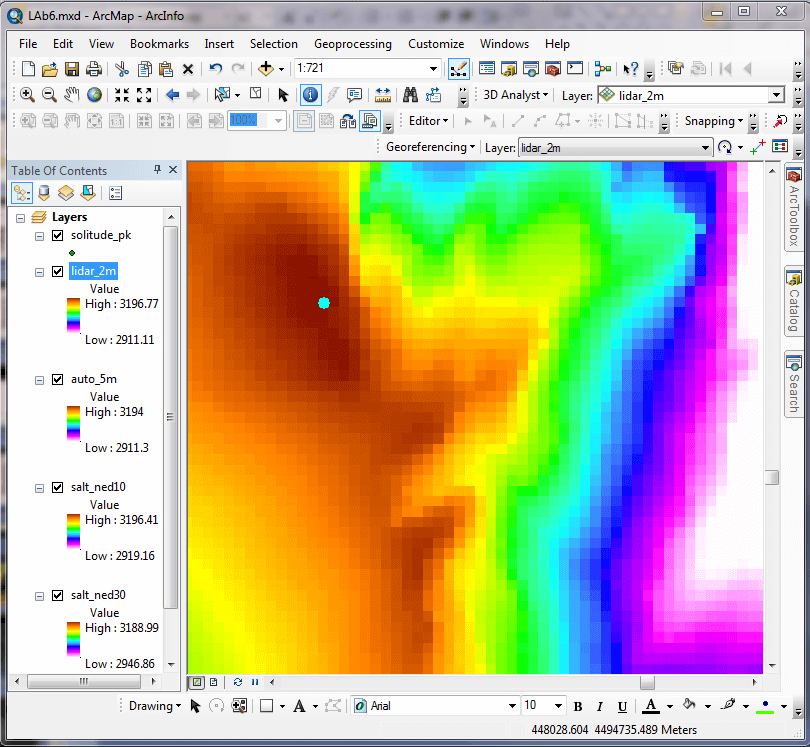
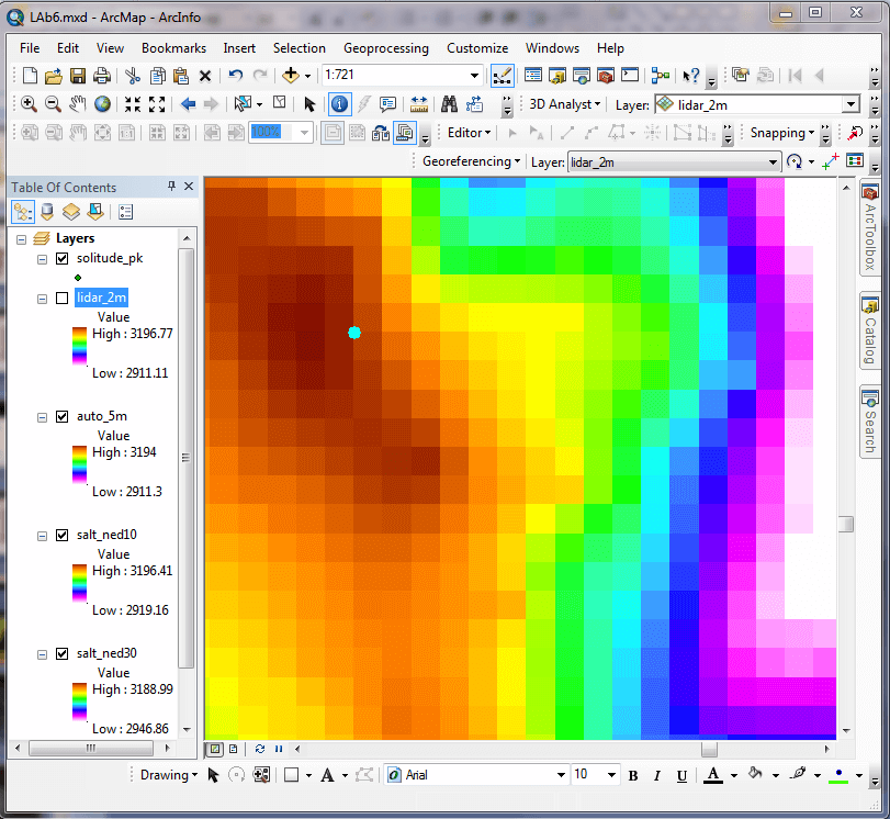
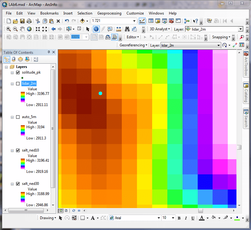
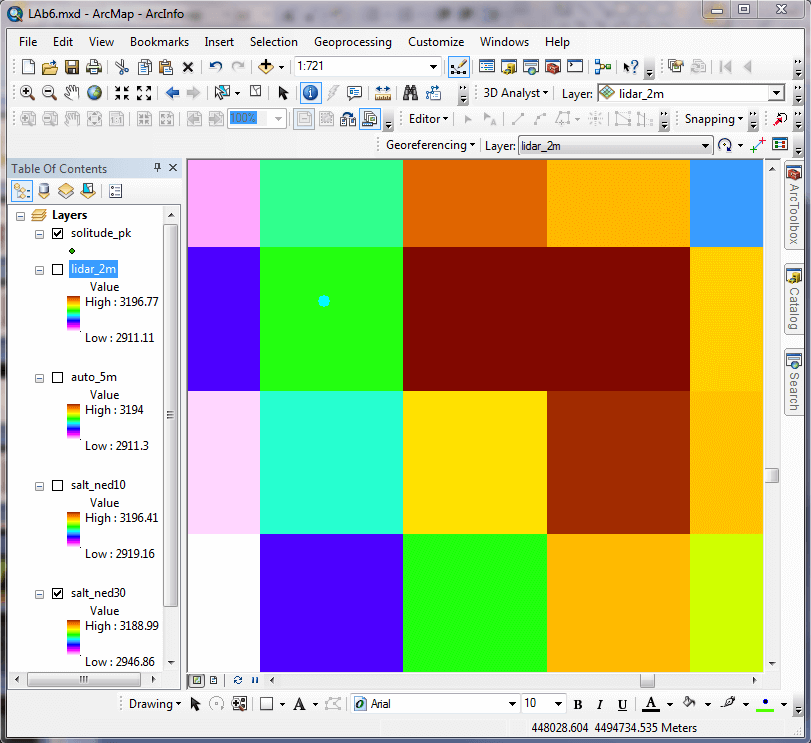
These figures show the 4 DEMs and the “peak” cell location relative to the peak cell point derived from the 2m lidar data.
When you use the Identify tool, make sure you are setting the “Identify from:” window to the layer from which you want to pull the elevation information.
Which DEM dataset should the foundation use to collect the elevation data and why? Include this information and a brief discussion about why the elevations and peak locations differ from dataset to dataset in your write-up.
How to Create Contours
Creating contours is easy with 3D analyst. In this video tutorial I walk you through the basics.