gis
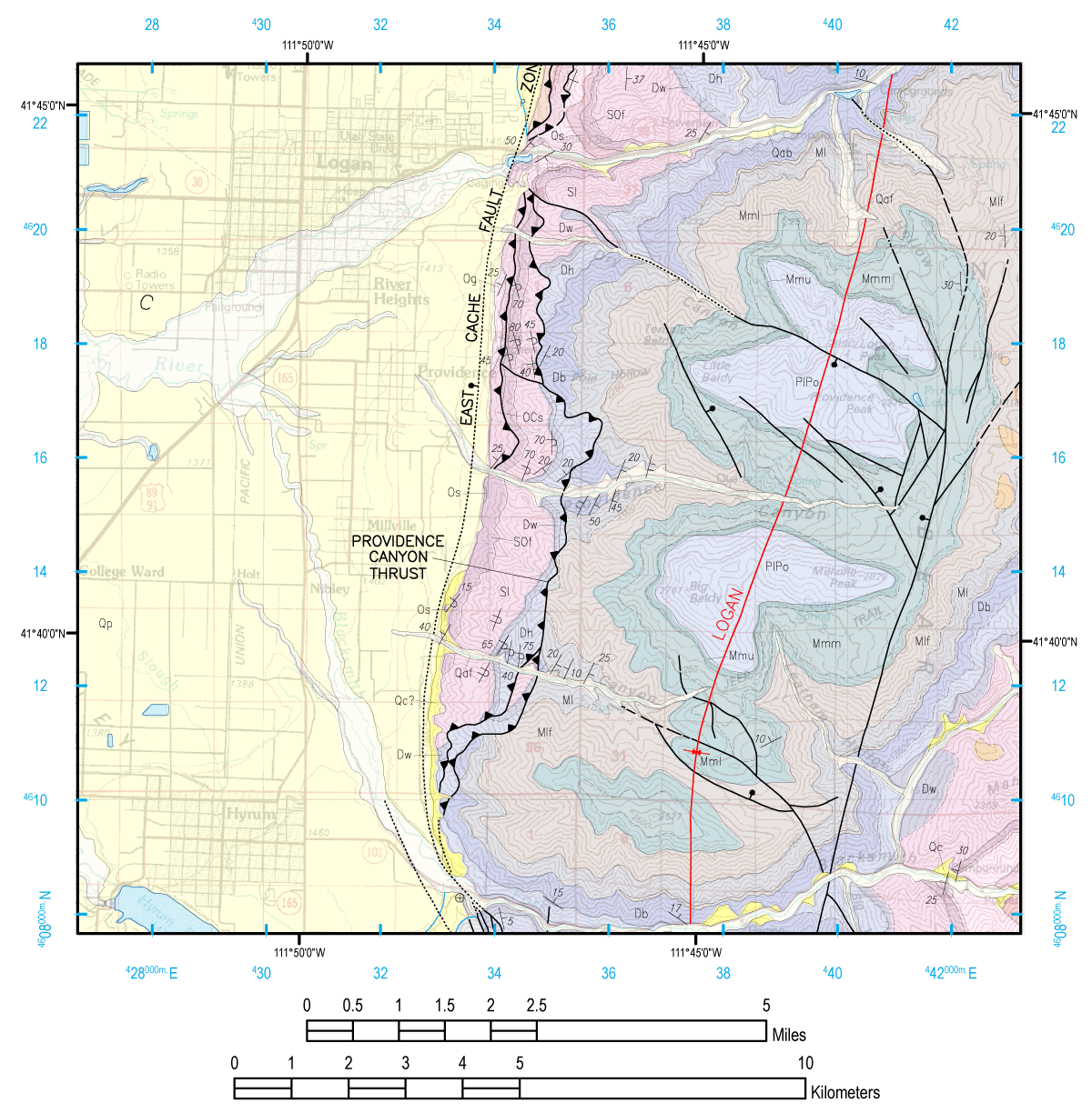
Here you are going to reproduce a portion of the 1:100,000 scale Logan (30’ x 60’) Quadrangle on an 8.5” x 11” page, which normally fits on a 36” x 26” page. You can either attempt your own workflow that approximates the map shown on the parent page, or follow the potential workflow spelt out step-by-step in videos below (old text and screen shot instructions here). The complete video tutorial playlist for Task 1 is here.
Bring in Data
- Open a new empty Map Document. Set the map page size (under File *-> *Page and Print Setup) to a portrait letter.
- First we will bring in the geology layers provided to us. Switch to Data View and add the geology layers and arrange in the following drawing order:
LoganBase.tif.lyr, geounits.lyr, geolines.lyr, folds.lyr, mapsymbl.lyr. Double check the ‘correct’ projection has been used and assigned automatically to your data frame. Make sure the geounits layer is adjusted with a slight transparency (e.g. 40%). The layers should appear the same as they do on the PDF from the Utah Geologic Survey website of this map. With all these layers loaded, you will notice that the map is rather slow to redraw. You may wish to turn off some layers you are not actively working with as you proceed and only turn them on as you need them.
The above steps are illustrated in this video:
Before you get to far, you may wish to save your map document!
Set up Page
Next we need to set up the layout view data frame so it fits neatly on our page for our area of interest. Follow video or see below for steps.
Basically, we are setting up the data frame window at a specific size to create room on the map page for our legend and title, ensuring that the display scale is 1:100,000 to match the original USGS map. Then creating a bounding box matching exactly the data frame size so we can clip the layers. This is an important step in limiting the number of rock types that will appear in the legend.
Preparing Data to Display in our Area of Interest
Next we need to clip some of our layers down to just the area of interest. We can physically clip the datasets and create new datasets, or we can use a display clip. We will use both here to learn the differences. We want to do a hard clip on the Rock Unit Types because ultimately we want this layer in our legend. Clipping allows us to limit the legend to only display rock types that appear in our limited map extent. See video, or follow steps.
Adding a Grid and Graticule
Most USGS maps have grids showing around the map collar for both a State Plane and UTM projection as well as a graticule showing for latitude and longitude. In addition they typically show the PLSS grid on the map. Because we’re using a USGS basemap as our bottom layer we have the PLSS grid showing, but now that we’ve clipped our view we have lost the other grids. The video shows us how:
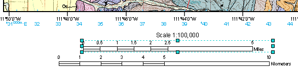
Scale Bar
Next we will add two scale bars, just as you see on the base of the 30’ x 60’ geologic map that your map is showing a portion of.
Adding a Legend
Next we need to add a legend. Our legend will not be as complete as the original map legend, but it will show the different rock unit types, contact, and fault types. We will show you a workflow in this video that gets you the Legend building blocks you need for export to Adobe Illustrator.
You will notice that in the video I attempt to follow my old instructions (below) for calculating a field and it does not work! I leave the troubleshooting steps I have to take in here to get a solution as they are helpful for you to witness. Given input from students I would suggest that you use the following code in your field calculator [UNITSYMBOL]+” : “+[UNITNAME] to resolve this issue. Depending on what version of ArcGIS you use, you may or may not have the same problem. I DO NOT show you how to make a legend for the line work, you can figure that out on your own with what we’ve shown you above.
Export what you need in to Adobe Illustrator & Ditch ArcGIS!
In this step, we show you how to export the building blocks you need from ArcGIS and into a format we can use them Adobe Illustrator:
If you want a more thorough introduction to Adobe Illustrator, see Figure Preparation Guidelines.
Assembling Building Blocks (In Adobe Illustrator)
Now that we have the pieces out of ArcGIS, we need to put them back together in Adobe Illustrator.
Fixing up the Legend (in Adobe Illustrator)
This is a very slow and tedious process… but this is what it takes to get what we need:
Labels, Text and Clean Up (In Adobe Illustrator)
This is tedious stuff, but that is cartography. Here’s the tricks for how to do it in AI:
Next we will add titles and notes. You should refer to the PDF of the geologic map (http://geology.utah.gov/maps/geomap/30x60/pdf/i-2210.pdf) for a rough indication of what needs to be included. Since this is a going to be an excerpt of an existing geologic map, we will not include everything, but instead cite the original map. Across the top of your map you can add a title along the lines of: “A Portion of Geologic Map of The Logan 30’ x 60’ Quadrangle, Cache County, Utah”. Beneath it, you should add a subtitle to the effect of “Originally Produced by J.H. Dover (1996) of Utah Geological Survey, Reproduced by Your Name (2014), Utah State University”. In the lower right corner in a small (e.g. 6 point) font add the notes:
Base layer from U.S. Geological Survey, 1984 Projection and 1000-meter grid zone 12N UTM (shown in blue ticks along interior edge of map). 1927 North American Datum. Geologic layers from Utah Geologic Survey map entitled ‘Geologic Map of the Logan 30’ x 60’ Quadrangle’, by J.H. Dover (1996) available from http://geology.utah.gov. . Refer to original map for full legend, rock unit descriptions, stratographic column and unit correlations.
Build a Location Map
- From the Insert Menu, insert a new data frame and rename it Location Map. Switch to the map view for this location map. Add a state outline for the state of Utah (remember you can get these from the Utah GIS portal, among other places). Change the display properties to show only a hollow state line for Utah. Next, switch back to the Layout View and right click on the display properties for the Location Map Data Frame. Switch to the Extent Rectangles tab and add the Geologic Map data frame to your list for ‘Show extent rectangle for these data frames’. You can adjust the display properties of the frame if you desire. This will show a box (or dot if map is small) depicting the map location in Utah. Add text labels for the state and location map.
####
North Arrow
Add a discrete north arrow at some location that does not clutter the map (note: the USGS normally depict this with a magnetic declination arrow from true north… we won’t… but you can dig into it if you want. (This is in the video above).
Read about magnetic declination here, Read about how to calculate magnetic declination for a specific place and time here. Read this to learn about setting calibration angles in ArcGIS 10.1. .
Export From Adobe Illustrator
Save your map and export it as both an image and a PDF. You will present these on your website. Here are some tricks and tips: