gis
If from Lab 1 we learned, a typical GIS map is supposed to have:
- North arrow
- Title
- Scale bar and/or grid or graticule
- Location Map
- Legend and/or Labels
- Notes about projection, coordinate system, datum, data source(s) and any other pertinent details
- Who produced the map
Elements of a ‘Good Map’, but maybe a Bad Figure?
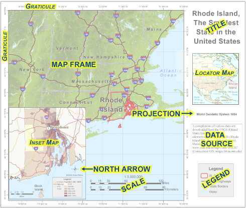
**Figure 1. **From ESRI’s How Maps Convey Geographic Information.
What’s wrong with this? Why does the map at right not always necessarilymake a good figure?
Bare in mind, there are some ‘wrong’ answers to some of these questions and choices in terms of map layout and what map elements to include. However, there is rarely a single ‘right’ answer and often you can justify inclusion or exclusion of different map elements based on the context (remember the 6 C’s). Is this subjective? Of course it is! But, we pose some questions and ‘rules of thumb’ below to help you make that judgement call so that your map is *convincing *for the audience it was intended for. To get a feel for hyper-critical critiques of maps, I strongly suggest you browse around or subscribe to http://cartastrophe.wordpress.com/.
Lets go through each piece:
Flaws in What You Were Taught
Titles
A big title on a map is not necessary when:
- The map is part of a figure that will have a caption (e.g. any report, manuscript, poster, some websites).
- The map is part of a figure that will be used in a presentation on a slide that will have its own title.
You may want to use a title if the map is a stand-alone static map. The title in Figure 1 above is not necessary if the figure is used with a caption that tells you the same thing. Sometimes, sub-titles are helpful to have on a multi-part figure (e.g. those in Figure 2 below) so that the reader can differentiate between the different maps being compared quickly, without reading the caption.
North Arrow & Scale bars
Sure, north arrows and scale bars are generally necessary*, but what if I’m making a figure that is a comparison of four maps, as in figure 2 below? Should I really have four north arrows, when north is always up the page? I need one, but not four. If you have multiple maps or inset maps in a figure that are at different scales, make sure each has its own scale bar. In the figure below, A & B are the same scale, and C & D are the same scale
*Arguably, they aren’t always necessary. When identifiable outlines (state, country, etc.) are visible and recognizable to your audience, north and scale can be easily ascertained.
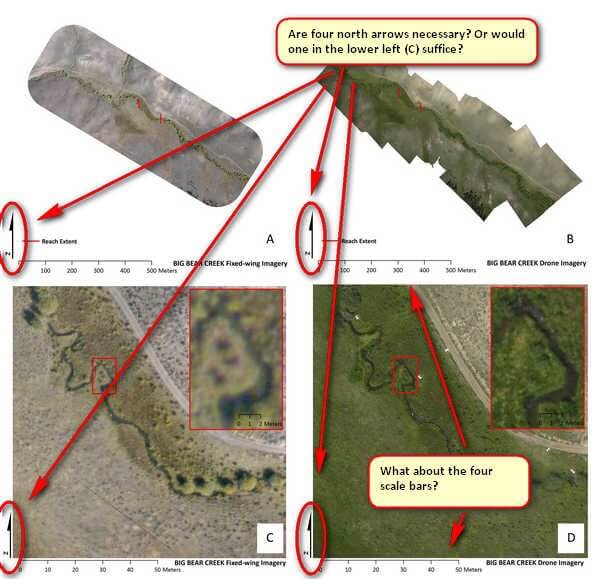
Figure 2 - Overuse of North Arrows?
Scale Bars vs. Grids vs. Graticules
- For every map without a grid, a scalebar should be present
- For figures with multiple maps (e.g. Figure 2 above) if all the maps are the same scale, only one scalebar is necessary. If the maps are different scales, multiple scalebars should be used.
- If you use a grid, a scale bar is optional, as it can just be providing redundant information.
- A grid or graticule (see Figure 4 below) can be very helpful in a location map or vicinity map, but sometimes in smaller figures they can clutter the map and provide nothing.
- One problem with both grids and graticules is the size of the text. At what size is the map going to be displayed in a figure? Will the font be at least > 6 pt font (ideally > 8 pt)? Do the text labels become distracting?
- Scalebars are optional for location maps (e.g. Figure 3), when the location map shows something that the audience will know is a particular size (e.g. a continent or country).
Location vs. Vicinity Map
This is where context (6 C’s) comes in. If you’ve already shown the location or vicinity map earlier in the report, manuscript, website, etc., do you need to show it again? Often, in reports and manuscripts, a stand-alone location map is shown early on in a ‘Study Site Description’ section, for example. In instances where there may only be one map figure or no room for a stand-alone location map, an inset location or vicinity map is sometimes used. It might be helpful to first review the difference between a location and vicinity map.
- A location map shows where your main map or area of interest is in reference to some broader geographic region that your audience will be familiar with. For the most general of audiences, this may be a map of the world or a continent, whereas for more specific audiences it may be a map of a state, county, city or watershed.
- A vicinity or inset map is similar to a location map, but generally shows a portion of the main map in greater detail.
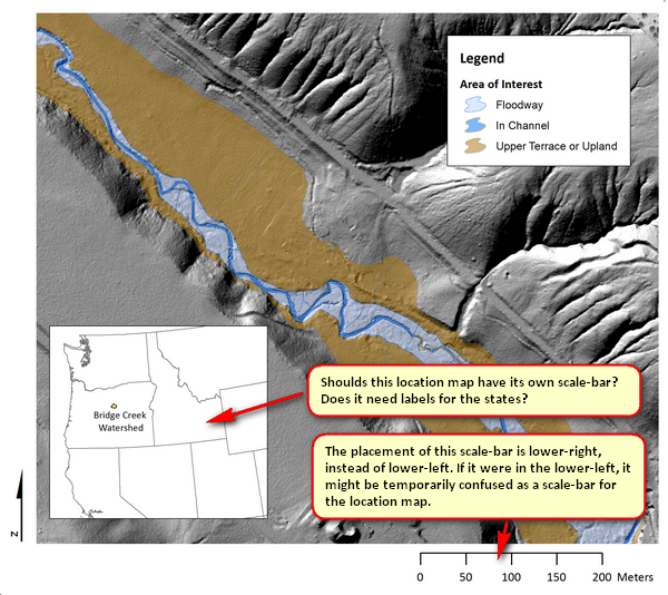
Figure 3 - Issues with Inset Location Maps
Legends and Labels
A legend is not always necessary for a map figure (e.g. Figure 2 shows only aerial photos so no legend is necessary). There are also some data sets where the symbology shown is so simple that it does not necessitate a legend or can be easily explained in the caption (e.g. 2 -3 categories) or with labels on the map. The placement of the legend and symbols (if used) should always be done as to not detract from the overall map nor make it the focus. The legend provides context and gives meaning, but should not be the main thing your eye is drawn to. In multi-part figures and maps that use the same symbology, the legends do not need to be repeated.
Colors
Color choice for color ramps or classified colors is critical to making an effective map. Cynthia Brewer did a whole PhD on the topic. Her work is represented in a fantastic interactive website called Color Brewer. What Color Brewer does is helps you choose colors for categorical color schemes that will contrast effectively, and are pleasing to the eye. You get to choose how many classes, whether you want a sequential, diverging or qualitative color ramp, and then it even lets you restrict choices to ‘colorblind safe’ , or ‘print friendly’ or ‘photocopy safe’ choices. You can then export the colors and use them in ArcMap or Adobe Illustrator directly.
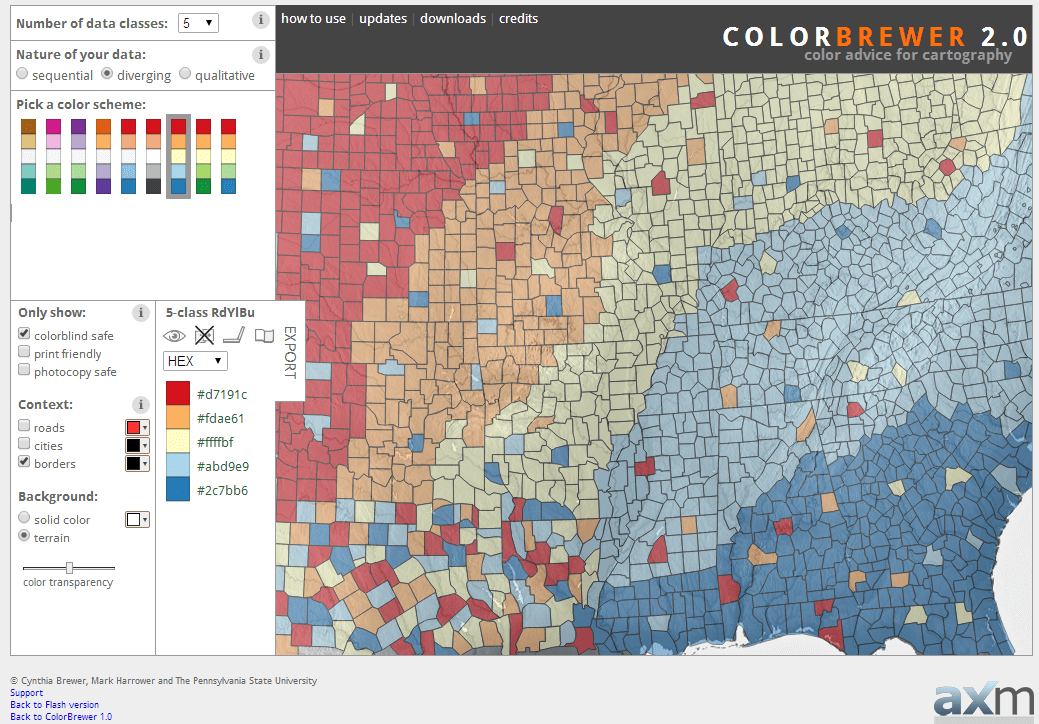
Color Brewer is so easy to use, it hardly needs explanation, but if you want a step-by-step on how to use it with ArcGIS, here you go:
Projections, Coordinate Systems and Datums
It is sometimes considered best practice to denote information about the coordinate system and datum you used in a caption or note (often in one of the lower corners) of a map. This is one where *context *comes into play. If your audience is or includes GIS Savvy readers, you may choose to list this information in a caption. However, in many instances information about the projection really does not make a big deal (e.g. Figure 3 above or Figure 4C below). Ask yourself if the meaning of the map is fundamentally different if it was displayed in one coordinate system or another (state-plane versus UTM, for example)? One case where it does make a difference is when you are using a grid or graticule. The labels in the grid (e.g. Figure 4A below) don’t have much meaning without the context of which coordinate system they are in or units. Plus, when a grid (Figure 4A) or graticule (Figure 4B) is used, you can avoid the need for a location map because this spatial location information is explicitly shown. We learn more about using grids and graticules in Lab 3.
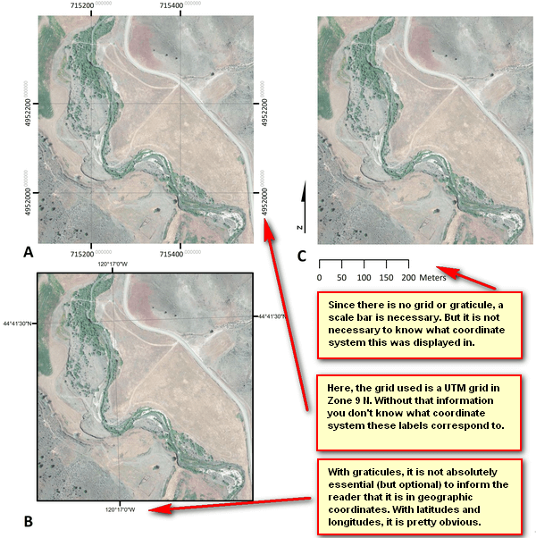
Figure 4 - Contrast between needing to report in caption that this the coordinate system was UTM Zone 10N, NAD 83 Datum and not. For A, which shows a grid, this information is essential. For B, which shows a graticule, this information is optional. For C, this information is not necessary.
Data Sources
If you are using data sources (e.g. aerial imagery) or other data layers that you did not produce or collect yourself, you should always cite them somewhere.
- For reports, manuscripts, webpages and posters, the most appropriate place to cite a data source is usually in the caption. However, if the same data sources are used in multiple figures throughout those outputs, the data sources can be mentioned somewhere in the body of the text (e.g. in a methods section).
- For presentations, a simple citation should be shown subtly somewhere on the slide (or at least in the presentation)
- For stand-alone static maps it may be necessary to provide a citation to the data source somewhere in the figure (e.g. Figure 1)
There are many standards for how to cite your sources. Pick one and be consistent. Our librarian has produced a helpful LibGuide for this class with a whole section on how to cite your GIS sources in different contexts.
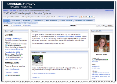
Figure 5 - Our LibGuide for this course, which covers where to find GIS data sources and how to appropriately cite them.
Who Produced the Map
Whether or not a this is a necessary element of every map or figure that includes a map is very *context *specific.
- *Report or Manuscript: **If the figure is in a report or manuscript where you are the author, it is assumed that all figures in that report were produced by the author(s). No figures should ever be included in any manuscript or report that are not either produced by the author(s) unless a caption clearly states where the figures came from (e.g. *Figure reproduced from Wheaton et al. (2010); or Figure adapted from Smith (2009)). If the figure is in a website, and has a caption, the same rules apply.
- **Webpage: **If a figure is in a website and does not have a caption, you may want to include something in the figure to denote that it is yours. However, if the figure is on your own website, we can probably assume that you made it (if not, cite the source!). If you want to legally share the figures that you produce such that anyone can use them, you can copyright them and use something like a Creative Commons attribution license (see bottom of page).
- Presentation or Poster: A little more latitude is allowed in presentations than posters, but generally we can assume all the figures are those of the author, and if not you cite the source.
- Online Gallery or Album: Given how these are used, it may
- Stand-Alone Static Map (Paper, PDF or Image): Here is the one case where you should include your name as map author.
What I typically do not want to see on your maps is something like:
Map Produced by: Joe Blow
WATS 4930, 2013
Utah State University
It looks like something a introductory GIS student would do (I know…. I know… some of you are!). Leave it out. If you want to put something like a watermark or transparent copyright (e.g. © Joe Blow 2013), you are welcome to. However, *context *matters again here. If you are preparing figures for submission to a journal, the publisher will often require you to grant or transfer the copyright to them prior to publication. If it is our own website, you may have a blanket copyright to the whole website. If it is going to appear on someone else’s website, you may want something more specific.
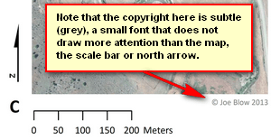
Figure 6 - Subtle use of a copyright symbol and acknowledgement of who produced the map.
Colors
See this for ColorBrewer color ramp suggestions.
Some Other Problems
White Space!
Be careful not to have unneccesary white space around the perimter of your maps and figures. When you insert figures into reports, manuscripts, webpages, posters and presentations, there will likely already be white space and borders. If your figures have additional white space on the perimters, it has the effect of just making your images look smaller on the page.
Typical GIS Maps Don’t Have Captions
Figure 1 above does not have a caption (as part of the figure), and even on ESRI’s website, it does not include a caption below it. I would encourage you to typically NOT include captions in your figures (i.e. in the image itself), but always use captions where you use the figure in a report, manuscript, poster or webpage. In presentations, captions typically are not appropriate. Depending on the context, it may be helpful to include a caption in a stand-alone map or figure, which you do not know how it may be used.
Where captions are used, they should be informative and help a reader understand what is being presented in the figure. Below in Figure X is a multi-part figure in which Olden et al. (2012) show two related maps that leverage data from other published papers and data sources. This illustrates nicely how you can re-use and appropriately cite existing data sources and published data sets with proper attribution.
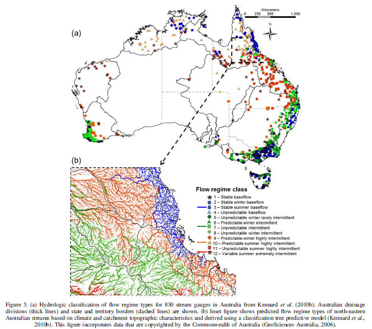
Figure X - The figure above is from a refereed journal publication in the journal Ecohydrology and illustrates the use of an informative caption. The figure and caption was reproduced without permission from Olden et al. (2012) - © 2011 John Wiley & Sons . Click on image for larger view.
Reference:
Olden JD, Kennard MJ and Pusey BJ. 2012. A framework for hydrologic classification with a review of methodologies and applications in ecohydrology. Ecohydrology. 5(4): 503-518. DOI: 10.1002/eco.251.
Making Citations Useful
When you do cite someone and provide a reference in a website, you should make those citations more useful to your audience by providing hyperlinks to them. For example, in the above example I have provided a hyperlink using the DOI (digital object identifier - a permanent stable URL) in both the citation to Olden et al. (2012) as well as the reference.
See here for more information on using citations in your writing.
Copyrighting And Sharing
For this class, you are not required to copyright your work, but you are required to share your work on your own website. However, you may want to copyright your work to protect yourself (especially if your website is open to anyone in the world). If you do copyright your work, you need to take extra precautions to make sure you are citing any other copyrighted work or data sources you might have used in preparation of your own maps and figures. Here are some things to consider in different contexts:
- *Report: **If the figure is in a report and you are solely responsible for its preparation, a blanket copyright for the report will cover you. Figures included in the report that are not produced by the author(s) should be appropriately acknowledged (e.g. *Figure reproduced from Wheaton et al. (2010); or Figure adapted from Smith (2009)).
- **Manuscript: **Every publisher has specific guidelines for how copyrights are handled. These often require or urge you to transfer copyright to the publisher, something you can only do if you own the work or get permission from the owner.
- **Website: **Websites often include content from other websites. In a perfect world, all this content is properly attributed. In reality, lots of things slip through the cracks. In 99% of cases the reuse of unauhtroized content is not malicious, even if illegal You should copyright your own website to protect yourself. If you do not copyright your work, it is possible for someone to take your content, copyright it and sue you for unauthorized use of it. If you want to share the figures legally that you produce such that anyone can use them, you can copyright them using something like a Creative Commons attribution license (see bottom of page).
- Presentation or Poster: It doesn’t hurt to have a copyright on any poster you create.
- Online Gallery or Album: Given how these are used, it may
- Stand-Alone Static Map (Paper, PDF or Image): Here is the one case where
You can over-do it on copyrights too. Some people find copyrights plastered all over the place distracting. Use common sense and place your copyrights subtly (so they are there if anyone looks for them, but don’t necessarily grab your eye). Using transparency can help make them subtle.
Subtle: © Joe Blow 2013 Obnoxious: ##©Joe Blow 2013
Creative Commons
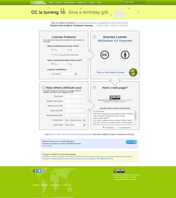
There are many ways to share your work in a manner that protects your legal rights and copyright. Perhaps one of the simplest of these that is specifically geared towards sharing your creative works (particularly digital media and data) is a Creative Commons license. There are six types of licenses you can use, which allow you to choose whether or not others simply have to attribute you, whether or not they can derive their own products from your works, whether or not they can use them commercially, and how they must share their derivatives (if allowed). What’s nice, is you can create your own Creative Commons license easily here, and apply it to a whole website or just a single figure or map. This is an example of what a Creative Commons license looks like (the one I used for this site):

Example Figure by Wheaton is licensed under a Creative Commons Attribution-NonCommercial-ShareAlike 3.0 Unported License.
Based on a work at joewheaton.org.
This is the form you fill out to create your own:
FigShare

If you want to make your figures (or reports and presentations for that matter) available publicly and have a permanent DOI (digital object identifier) you can post them on FigShare. One of the advantages of using figshare, is you can get a permanent, stable DOI and URL, as well as providing people with a simple way to cite your work. One of the disadvantages of figshare is once you post something, it is permanent and you can never remove it from the public domain.
Ahead to 2. Planning your Figure Layout ->